The Problem
One in seven children in B.C. live in poverty. At first, I wanted to explore why these children were struggling worse in school compared to their more privileged counterparts. The more I explored, I found that if I wanted to design a meaningful solution, I’d have to look at the root of the problem instead of the impact. After an interview with Sarah at Poverty Advocacy Nanaimo (https://pananaimo.ca/), she said “I love what you’re doing, but it’s not about the schools at all”. So, I shifted my focus. How can I empower teens to make good choices and break the cycle of poverty?
The Goal
I want to provide teens in poverty with an understanding of their situation, and an accessible way to access the resources that will help them break the cycle of poverty.
Phase One
Some Considerations:
My research began with assessing the most recent BC Child Poverty Report Card to see what’s already being done, and where the gaps are. I also assessed what the meaning of poverty really is. It’s the lack of ability to meet basic needs such as food, shelter, water, and hygiene. Next, I researched what help was already out there for teens in poverty and conducted interviews with local people in the space. I noticed that many resources already exist for my demographic, it can just be very overwhelming to access them.
I found myself wanting to create a swiss-army-knife solution. Can I design something that helps the teens meet all of their basic needs?
At this point, I had a lot of information on how local teens in poverty are getting through their challenges, and a lot of heavy emotional weight. I started thinking about solutions, and realized that I have to treat this situation with delicacy and empathy. This is where I started thinking about colour palettes, type, size, and other accessibility issues. I also thought about budget.
Phase Two
I quickly realized as I transitioned to the design phase that my ideas for do-it-all solutions were not realistic, budget-friendly, or sustainable. My demographic is teenagers in poverty; they need something simple, friendly, and empowering.
This is where Glimmer: resources for teens is born.
Glimmer is a journal and website combo that aims to empower, support, and provide teens in poverty with resources to help them break the cycle.
Glimmer provides teens in poverty a ‘field guide’ to life, including:
Low-cost recipes
Community resources
Budgeting worksheets
Basic home repairs
Fillable sheets (for personalized resources)
The journal is sturdy and high quality, with a simple cover design and lots of stickers for the teen to decorate their journal and provide a sense of autonomy and excitement. The design will explore themes of empowerment, creativity, and limitless potential. I want to ensure that this journal has a positive impact on their life and that they associate it with choice and freedom.
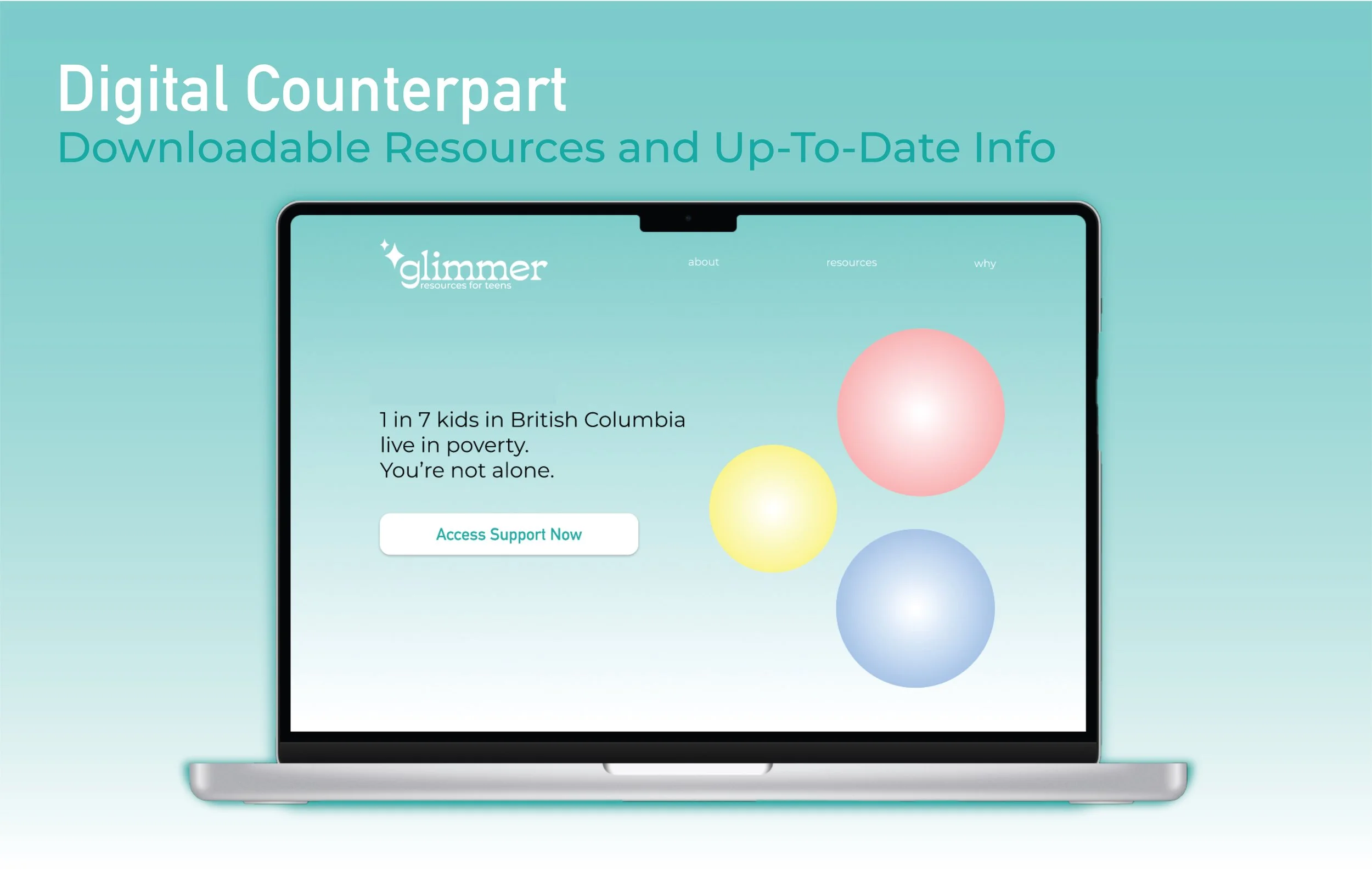
The website companion will include downloadable PDFs of the worksheets and an easy-to-navigate hub for up-to-date resources. This will be essential for kids who lose the journal or who may not have access to a journal in the first place.
Glimmer comes from the phrase “a glimmer of hope” which is at minimum what I want to provide the children in poverty. I will use calming and uplifting imagery in Glimmer’s branding to make it accessible and not overwhelming to look at for teens who may be struggling.
The Design
The colour palette includes a bright teal to invoke a sense of balance and reliability, paired with soft gradients that are indicative of different categories (money, food, home, self). The typefaces are fun, welcoming and easy to read. The theme of space + planets is intended to invoke a sense of limitless potential. A large inspiration of this project was ‘Oh, The Places You’ll Go’ by Dr Suess, and the final page saying “Kid, you’ll move mountains!”.
The fillable pages are intended to be easy to follow and leave plenty of space for people of all abilities to fill them out. The language is friendly and welcoming. I want Glimmer to feel more like a good friend who is helping guide them through a challenging situation.
Conclusion
The evolution of this project gave me a deeper understanding of a situation that is very challenging. Considering budget and accessibility meant that I had to be resourceful with my design choices, and some things that I really loved fell by the wayside but instead a clean, friendly, and simple design became the center point of something that hopefully can help many teens break the cycle of poverty and thrive.


